SEO and Website Design Kedah - Google Agency Malaysia
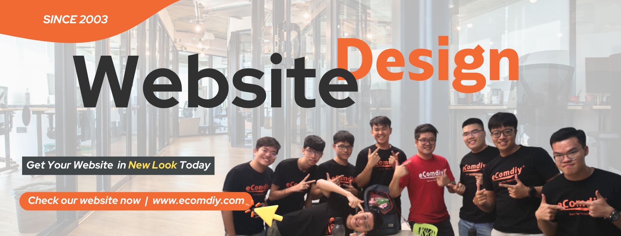
Have you been using the same website design from 5 or even 10 years ago?
Does your website still look the same on a phone as it does on a desktop — cluttered, outdated, or just not working as expected?In today’s fast-moving digital world, a website is no longer just an online brochure. It’s your brand identity, your sales tool, and often the first impression customers will have of your business. If your website looks old, chances are your visitors will think your business is outdated too.
What Is Mobile Responsive Website Design?
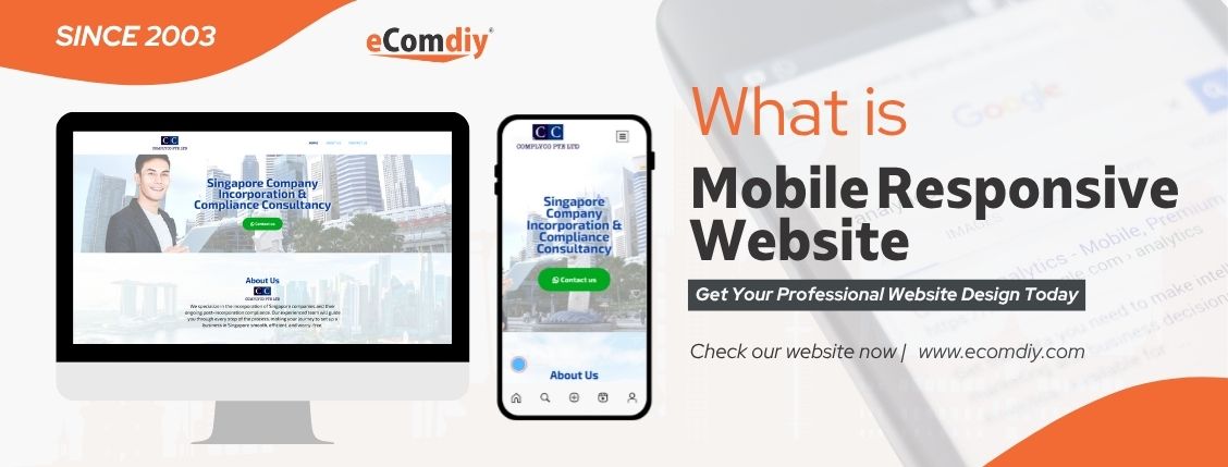
Mobile responsive design means your website can automatically adjust its layout to fit any screen size — providing a seamless and user-friendly experience across all devices.
At Ecomdiy, we ensure your website displays perfectly on:
Desktop –
Full-sized layout when viewed on a computerTablet –
Adjusted layout when accessed via iPad or Android tabletMobile Phone –
Automatically switches to a clean and compact mobile viewThis is the latest technology in web design — ensuring your visitors have a smooth, optimized browsing experience anytime, anywhere
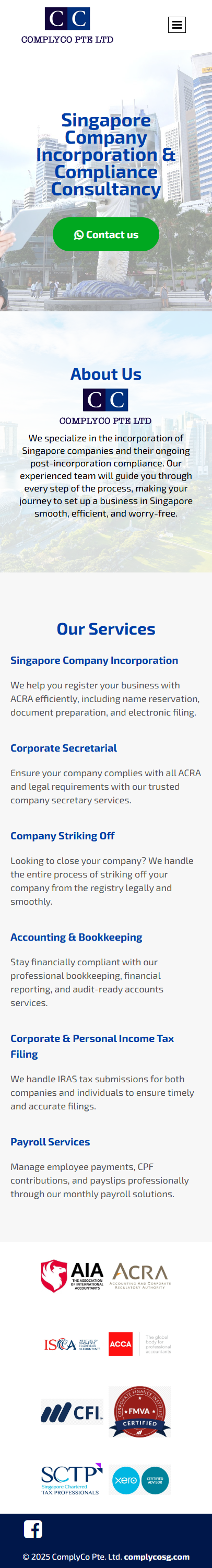
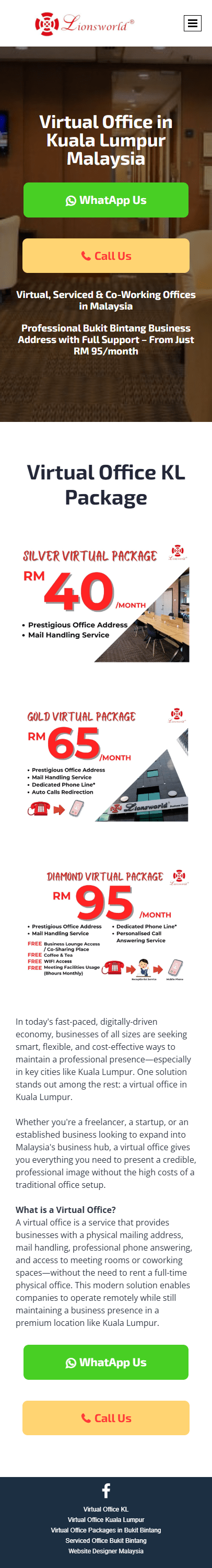
Here are some of our clients’ websites designed and developed by Ecomdiy. We help businesses go digital with professional, mobile-responsive websites.
Desktop Version
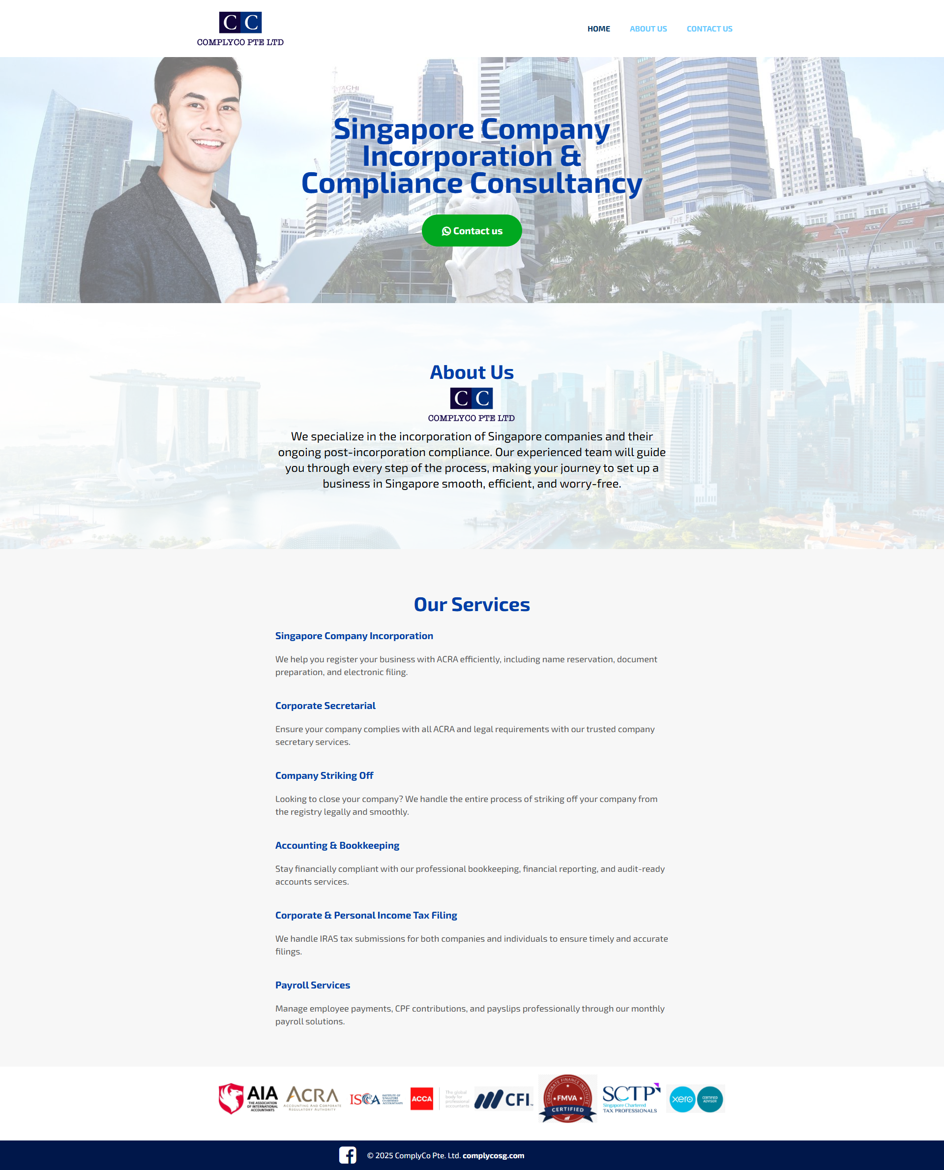
www.complycosg.com
Mobile Version
Desktop Version
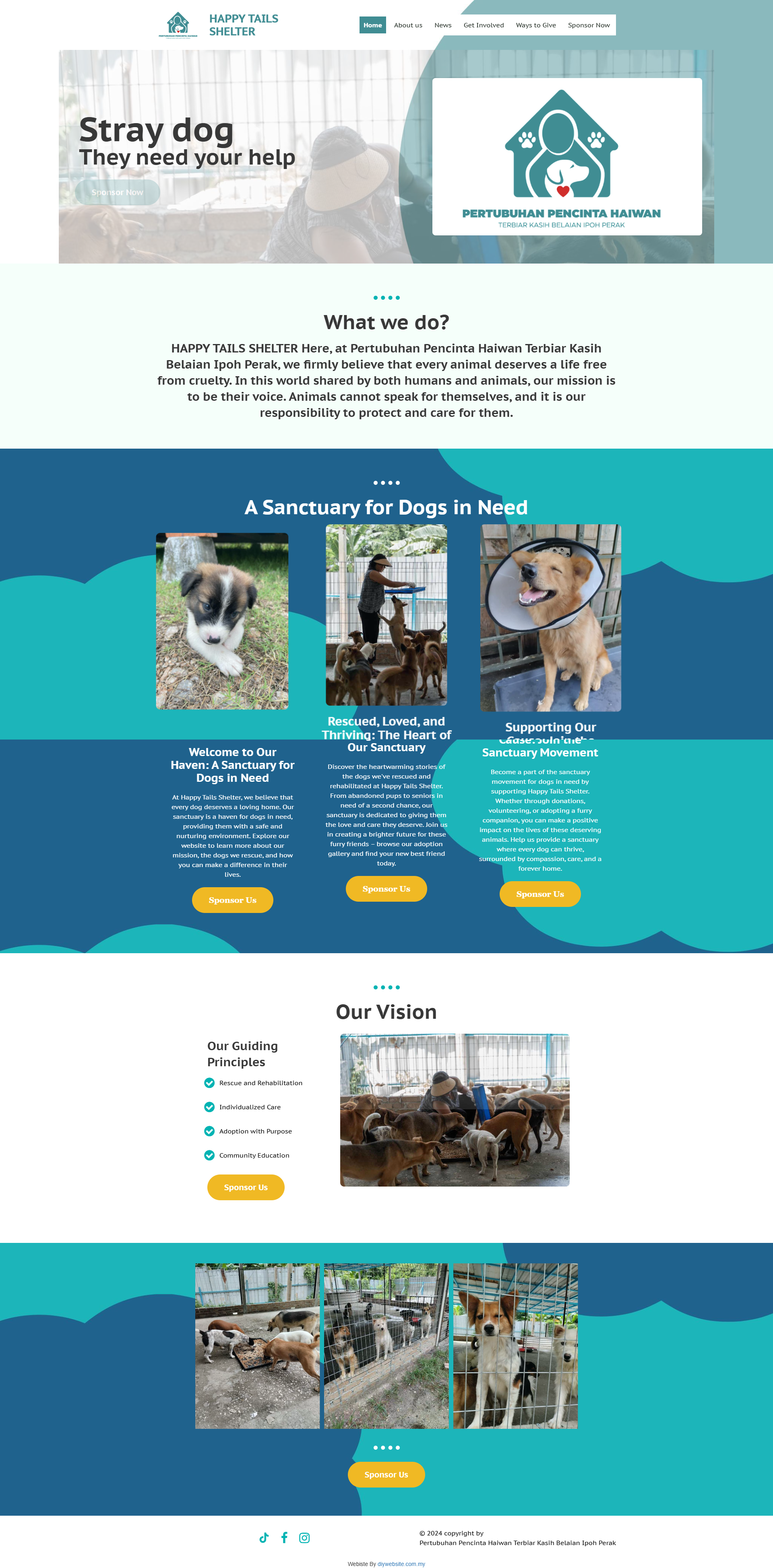
www.happytails.com.my
Mobile Version

Desktop Version
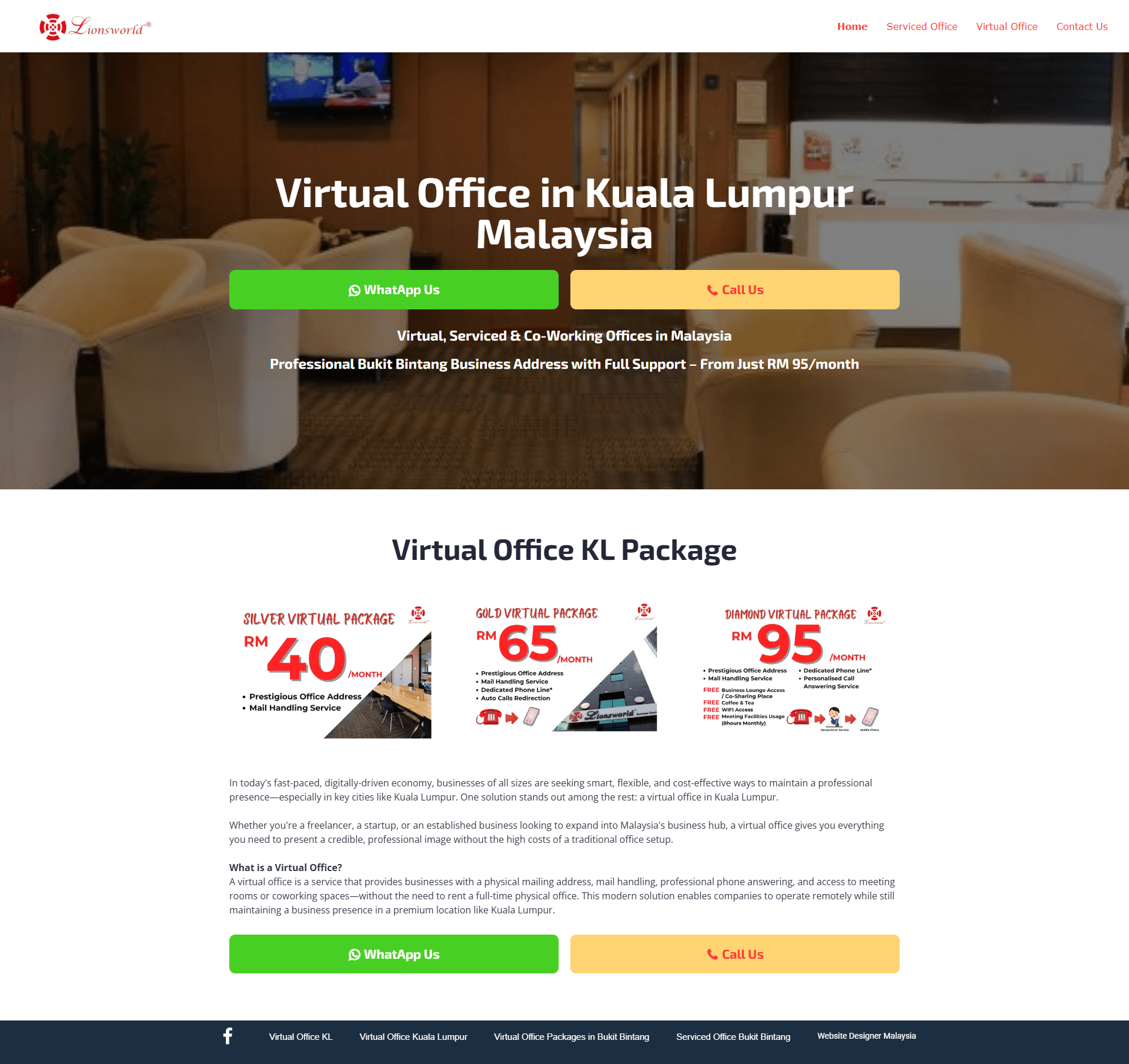
www.lionsworldoffice.com
Mobile Version
How much does website design cost in Kedah?
Website design in Kedah typically starts from RM1,500, depending on pages, features, and customization.
How long does it take to build a website?
Most websites are completed within 1 to 4 weeks, depending on scope and content readiness.
How long does it take to see results from SEO?
You can expect noticeable results within 2–6 months depending on competition and keywords.
How much does SEO cost in Kedah?
SEO packages range from RM1,500 to RM10,000 per month depending on goals and complexity.
Can you guarantee a #1st ranking on Google?
No agency can guarantee 1st Rank but we can Guarantee Top rankings. We follow best practices and aim for long-term sustainable results.
Do I need to sign a long-term contract?
We offer flexible plans starting from 12 months. Most agencies require 12-month subscriptions.
-80x80.png)